




Colourful Wedding Invitations
May 12, 2026
Creating My Own Wedding Stationery!
It might seem like a breeze for a wedding stationery designer to create her own wedding stationery, but for me the options were endless, and so I found it so hard to choose! Let me show you the journey I went on to create my own colourful wedding invitations and stationery.
Our Wedding Vibe
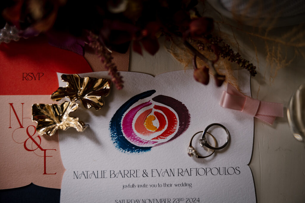
Evan and I got married on November 23rd, 2024, and it was the most perfect day. Not because all the things were perfect, but because we’d infused our day with all the things we loved, making it meaningful and special.
We spent a long time planning what we wanted to include, and part of that was the colour palette. If you know anything about me, you’ll know that colour is such an imporant part of the mood that you want to create. Colour evokes a feeling instantly, and you want to get that right. We also knew that we didn’t want to follow trends, because it was more important that the wedding felt like us. So, what colours to choose? This was so important as a base to choosing wedding attire, florals, styling, and of course the stationery.
When building our colour palette, we actually started with what Evan wanted to wear. We did this because there isn’t traditionally a lot of colour options for men’s suits. He was keen on wearing something that wasn’t black, while still retaining a classic look, so he settled on navy blue. I love pink and purples, and it felt like a no-brainer to put all those together. We then added in yellow and orange to brighten up the palette and make it feel fun, beautiful, and rich!

We also knew we wanted a light and modern space for the wedding reception, and had accommodation onsite. We chose Balgownie Estate in the Yarra Valley to compliment our colours and maintain an elegant and contemporary vibe.

Wedding Stationery Ideas
Don’t worry, I’m getting to the wedding stationery! It’s so important that the invitations are cohesive with the rest of the vibe and styling, and so this is why I’ve been setting the scene with other main elements. My advice if you’re planning your own wedding is to be really clear on the vibe you want to have on the day, then choose colours and make a moodboard. Then it’s so much easier to make decisions in line with that.
When I design invitations, I start with the form. Form is the layering of the suite, the stacking, and how it comes together. It’s also the shape of the pieces and how many cards you have. For me, form is probably the hardest part of the design, because it’s the start and all you really have is a vague idea of what you want at this stage. And there are endless ideas with form!
I started with sketching some ideas, and playing with paper shapes. I knew I wanted an interesting shape, and for the invitation and an RSVP card to come together somehow. Avoiding a basic clasp, I knew I could come up with a creative way to have them sit together. I LOVE textured paper, and so I had to include that as well.
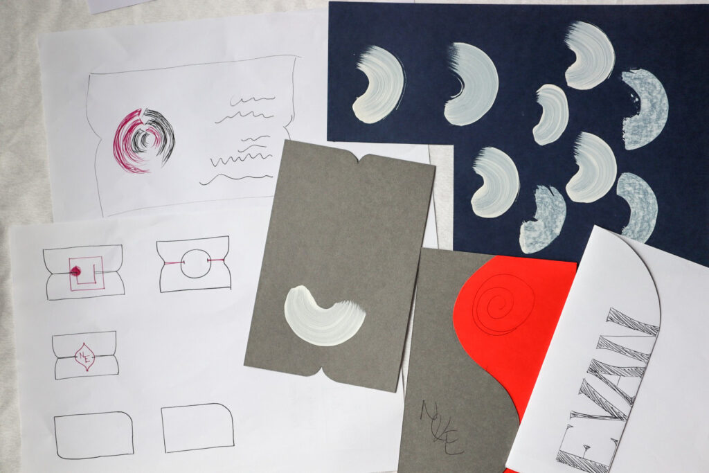
I did a lot of drawing. I drew shapes and layers, and loved a circle shape. The circle could also be used in the ceremony arbour, and repeated across the invitations and other stationery. I finally developed an arrangement where I could tuck a round RSVP card into the back of the invitation by creating a little slot for it to sit in. Once I solved this design issue, everything else could come together.
During this process, one of the ideas was to tie the pieces together and have the tie sit in little indents cut into the side of the paper. Even though I didn’t end up using any tie, I kept the indents, and the petal shape was born.

So, the form for these colourful wedding invitations was finally created! I knew that bringing this design to life would involve a very finicky process of sticking a front and a back petal shape together after lining them up perfectly. But luckily, this is part of what I love as a stationer! I love working with paper and I have great attention to detail, so it was a labour of love that I was willing to go through!
Painting a Design
I was certain that I wanted to paint something on my colourful wedding invitations. I have a few hand-painted invitation designs that I offer clients, and this has been something that I have absolutely loved doing for couples because it is just so special to create little works of art for each guest.
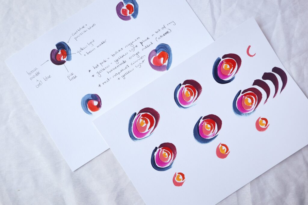
But what to paint? I wanted to again use the circle shape, and I came up with the idea to have seven semi-circles all come together like they were hugging. Why seven? There are seven of us in our blended family, and I wanted a nod to all seven of us coming together as a new family on that day.
When our last baby was born, Evan used his 3D printer to create for me an ornament of seven bears that all fit together like a jigsaw. Each bear is a different colour, and this was the inspiration for the painting. Could I fit seven colours together in a beautiful way, as the hero of the wedding invitation? I practiced some options and decided that it would sit in the top half of the invitation above the text.
The All-Important Font
Ah, fonts. There are about a BILLION fonts to choose from. Fonts (or more acurately, typefaces) have their own little personality, and so you have to make sure that you’re choosing a font that expresses what you want to say!
During 2024 when I was designing these, I was also breastfeeding Ruby. She was under 1, and we were spending a lot of time in that comfy blue chair! So I would sometimes spend that time browsing Creative Market for font ideas. I remember looking through so many fonts, I of course wanted something that was elegant, but also had a little unique twist. Frustratingly, the save option inside Creative Market wouldn’t work on my phone, so when I found a great font I had to screen shot it to save later on my PC. I ended up with a bunch of these that still live on my phone, like a true millenial.
After looking at how our names would look using a few final options, I finally settled on the main font that you see in the images. I loved it so much that I thought it was appropriate to use it in my rebrand of the business as well!
I already knew which font I would use for the “body copy” which is the paragraph text that comes after the heading. That font I have loved for many years and will occasionally use it in some of my client’s designs. I almost exclusively only use two fonts in each stationery design, so the pair was complete!
The Couples’ Monogram
Now that the fonts were chosen, I could work on creating a monogram for us using our first initials. I love playing with type, especially ampersands (the symbol that represents ‘and’). So I messed about with adding some decorative curved shapes (again, the circles!) and created a monogram for us that we could use across the invitation, the menu, and even the digital display they had at Balgownie Estate.
The Final Colourful Wedding Invitation
After all those design decisions, the invitations were created! The only thing left to do was to decide which coloured paper I would use for each part. That revolved around the fact that I could only get my favourite plum coloured paper in thin paperstock, not card, so that had to be the colour of the envelope liner. Since we already had our colour palette, I chose the other items (the back of the invitation, the RSVP card, and the envelope) in the other main colours, making sure not to put the navy blue directly next to the red, as that tends to end up looking like a flag!
I shared some behind the scenes footage on Instagram of painting my colourful wedding invitations here, where I also talk about how the painting was inspired by by Nana who taught me to paint when I was little.


Matching Wedding Stationery
To match my new colourful wedding invitations, I then had to create some on-the-day stationery for the ceremony and the reception.
This was of course much easier, because the design decisions were made. My only little snag was that I wanted plum coloured signs, but as I mentioned I could only get paper not card. So I ended up using a slightly different cardstock and went with a merlot-coloured card for the signs. I created mini signs for the table numbers, ceremony bubbles, the wishing well, and the bar, in the petal shape that I had used for the invitation. They sat up using beatiful quartz stands from Quartz and Crystal Co.


Meaningful Bonbonniere
Bonbonniere or wedding favours can sometimes get a bad wrap as meaningless or wasteful, and so Evan and I wanted to take this opportunity to acknowledge Evan’s Greek heritage. Two years earlier, we had all travelled to Greece for a holiday; it was the first time any of us had been there. We visited Kefalonia where Evan’s mother is from, and this island is well known for its bright red mandolas. Mandolas are a candied almond, covered in a lumpy red sugar coating! Ugly and delicious. We wanted to give these out to our guests, and wrap them in paper. This way I could also print some information about mandolas on the back, and have the guest name on the front to double as a place card.
Getting the mandolas was a real challenge, we ended up having to ship about 2 kgs from Greece, after having some email contact with a shop in Argostoli and sending our money via an international bank transfer! Thank goodness they arrived, safe and on time, and I set about creating a paper wrapper for these delicious little treats.
Again, there were design constraints, because I wanted the paper to wrap around the mandolas, and for them to also double as a place card. After much drawing and folding, I came up with the idea of printing on a large circle (again, the round shape), folding it up, and tying it with a ribbon. I’m really happy with how these turned out!
You can see me assembling the bonbonniere over on Instagram here.
(Note to self: Tie the 120 ribbons before you get acrylic nails for the wedding.)

The Colourful Escort Card Display
Oh the escort card display was a beast, in all the right ways!
I decided that I desperately wanted an escort card display instead of a more common table seating chart. These displays have guests come up and select their own card, which shows them their table number. It’s interactive and fun during cocktail hour, and makes for a really striking display.
I had those beautiful colours in my colour palette to choose from, so I chose envelopes in all those colours except for the red. Next, I did a mockup in Adobe Illustrator by blending the lighter colours at the top into the darker colours at the bottom, so it looked like a gradient. I alphabetised the names, and matched the names with the coloured envelope.
The escort cards were made in the remaining colour, red. We had three long tables at our reception, so rather than simply writing the table number, I drew a diagram of their table and marked their seat with a heart.

Of course, I couldn’t assemble this beauty on my wedding day, so I enlisted the help of my friend and wedding planner Caitlin from Paradise Hunter. Yes she was a wedding guest, but she arrived early to put together this whole arrangement, including applying the decal heading. With the backdrop from Bentley and Bobbi featuring a round inset, this display was everything I could have hoped for and more.
You can see all her hard work in this timelapse on Instagram!

Btw, if you’re in Melbourne/Victoria, and are interested in having an escort card display, please get in touch and let’s chat about how we can bring this to life for you!
A Labour of Love
Creating my own stationery was a dream. Yes there were some hard design decisions, but that’s part of the custom process. Once you have the constraints, like the colours, shapes, and some form options, this helps to birth ideas of how it can all come together. Then it’s just a matter of adding all the beautiful details.
So much work goes into custom design, the idea generation, the testing and playing, the thinking in the shower! Not to mention the test pieces, printing and painting, and the assembly of so many pieces. But it’s all worth it, for a meaningful and unique piece that represents you as a couple.
If you are thinking about a custom design for your own wedding, take a look at my custom design package here.
Or you can read about more memorable moments at my own wedding here!
