


Painted wedding invitations for Tendai and Batsi
July 25, 2023
With deep autumn reds and a unique vision for invitations, this wedding brings so much love and beautiful details. Read on to learn about Tendai and Batsi’s painted wedding invitations and the day of their dreams!
The first steps
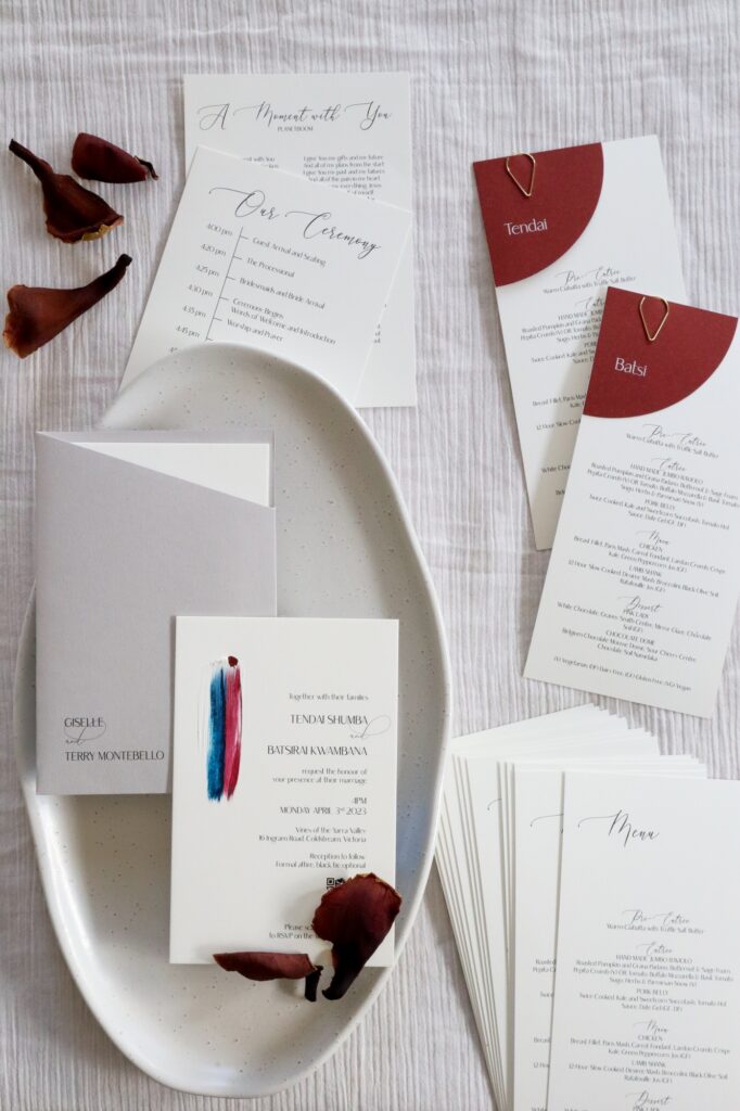
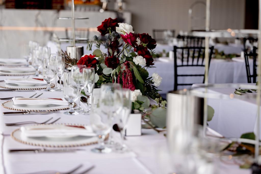
Tendai first reached out to me about 6 months before her wedding, inquiring about wedding invitations and other stationery for her wedding in April 2023. She booked a call with me so we could discuss everything she needed. Tendai described the wedding aesthetic as “rustic with a touch of luxury,” with colours of ivory, burgundy, and greenery. Their wedding venue Vines of the Yarra Valley was the perfect setting.
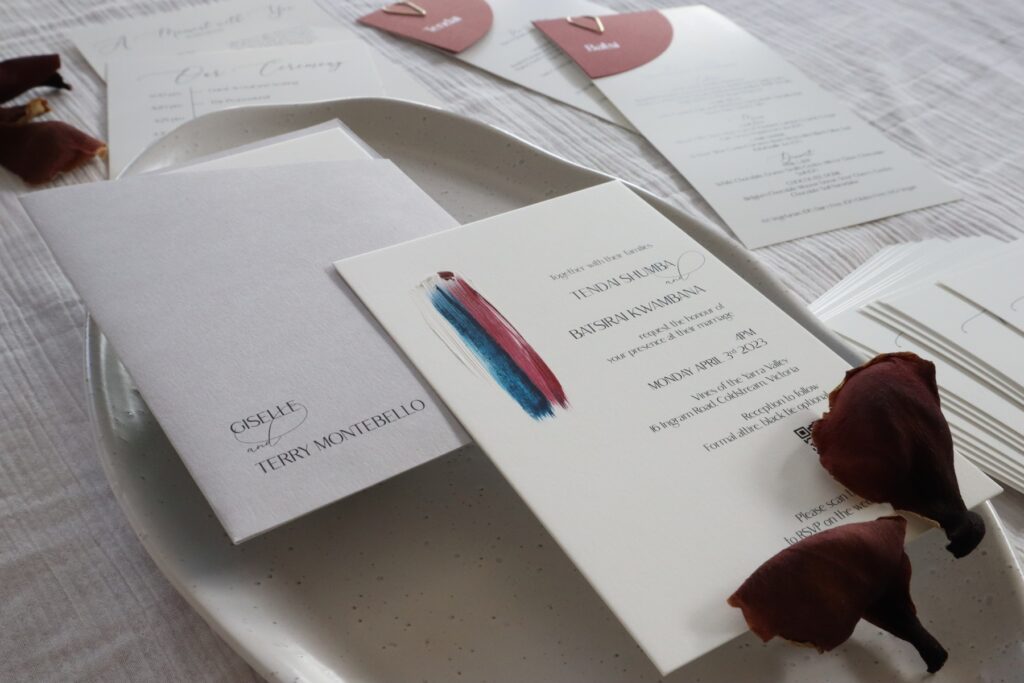
Tendai initially wasn’t sure about the exact vision for her invitations, which is very common. There are so many options out there, from colours to papers to graphics to shapes and more! This is where I stepped in as the expert, to offer her options that I thought would suit exactly what she was looking for. Tendai told me that when she saw the Artisan Collection of painted wedding invitations, she felt like “it’s me,” and had to choose this design. The Artisan Collection offers incredible flexibility, because I custom-mix the paint colour to match the cards or envelope. The idea for her invitations was born!
Creating the painted wedding invitations
After the call, I created a digital mock-up of the invitations we discussed, so that Tendai and Batsi could visualise what all the cards would look like together. It was then that Tendai came up with a brilliant idea. Most of the wedding guests were attending their engagement party in December, so they could receive them in person. Rather than enclosing the invitations in a standard envelope, why not create a sleeve with the guests’ names on the front, and lose the envelope altogether (you can see me talking about this sleeve in this Instagram Reel)? I love the way that she choose a unique and intriguing element here – it’s why I do this work!
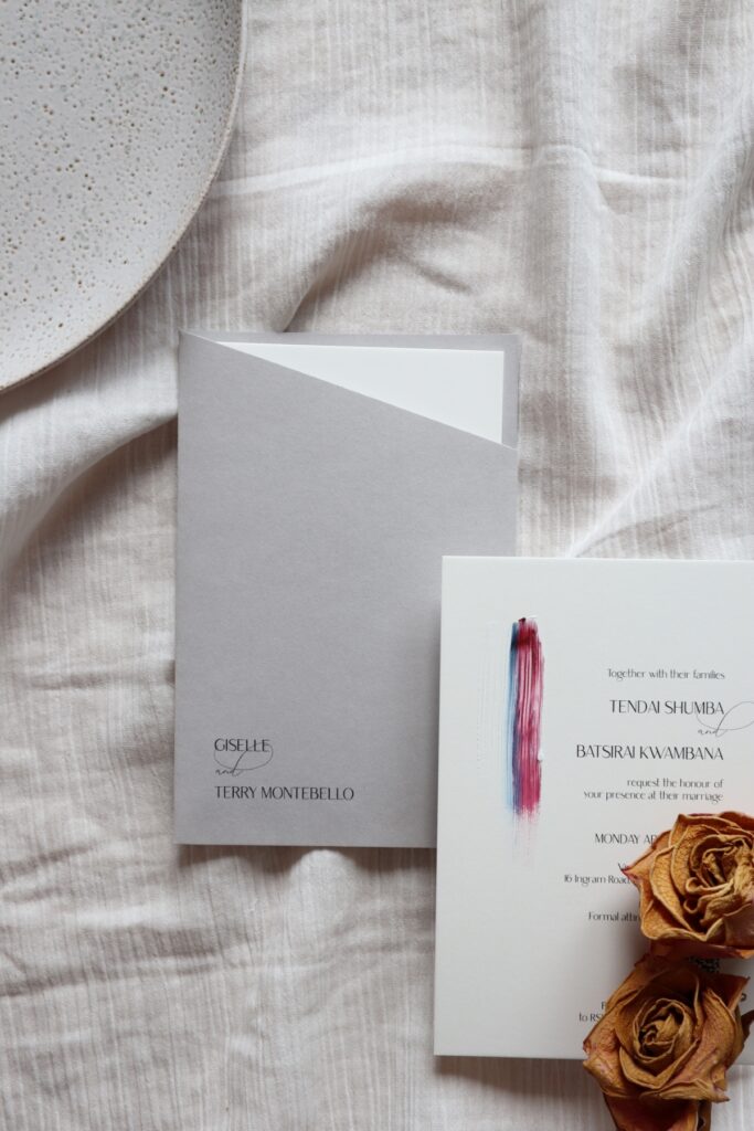
Once the final design and colours were chosen, the printing was completed on double-thick card stock to add another touch of luxury. Then the best part began. I painted all the invitations in their burgundy and navy blue theme, each one turning out slightly different. These pieces are like little works of art for the guests! Take a look at this short Reel on Instagram of the painting.
Love the painted wedding invitations? View the Artisan Collection here.
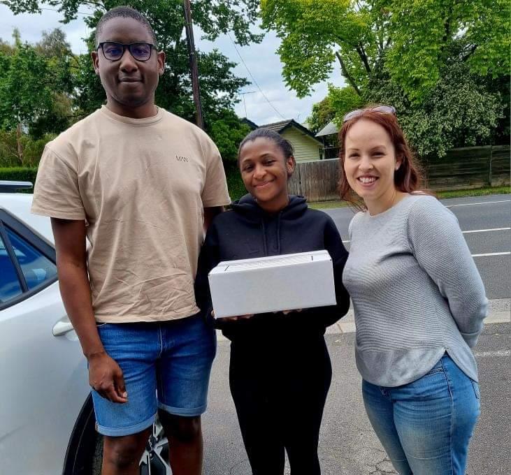
They take a week or so to fully dry, because there is a secret ingredient in there besides the paint to make it more three-dimensional. Then it’s assembly time! When they were ready, I happily hand-delivered them to Tendai and Batsi so they had them in time for their engagement party. I was happy to hear that the guests loved them!
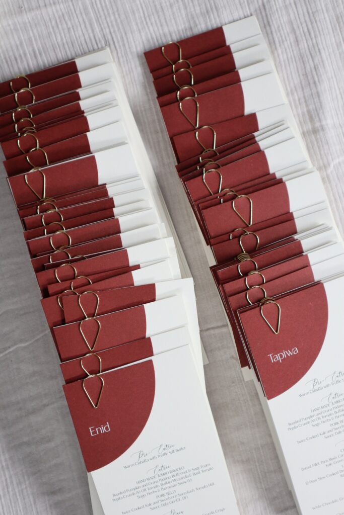
Menus and place cards
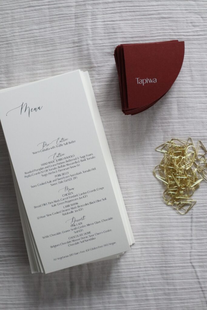
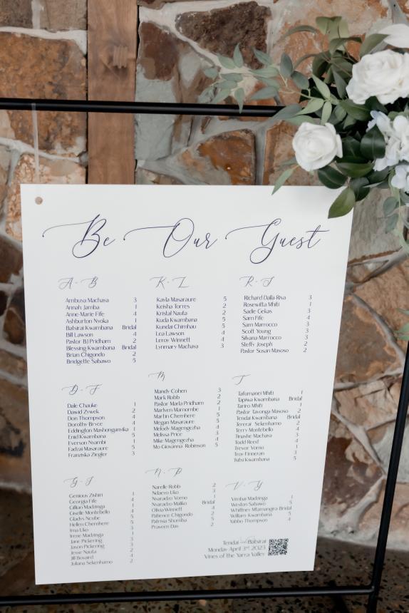
I like to work with couples in two separate jobs – one for the invitations, and one for the on-the-day stationery. This is beneficial for a few reasons. Couples can see the invitations in person before deciding exactly what design to order for their other stationery, and they wait until all RSVPs are returned before planning what they need. By February it was time to work with Tendai again to create her menus, order of service, welcome sign, and table seating chart.
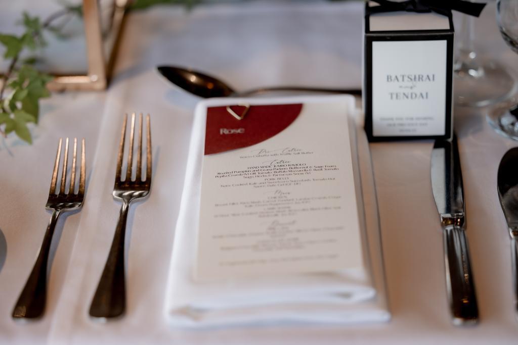
With again so many options to choose from with designs, Tendai spent time looking through my website and Instagram to see something she liked. The layered place cards and menu combination was an easy choice for her! The unique shape and the gold teardrop clasp again conveyed that elegance that she was looking for. Creating these in the same cardstock that was used for the invitations brought cohesion across the styling for her wedding.
Signage and thank you cards
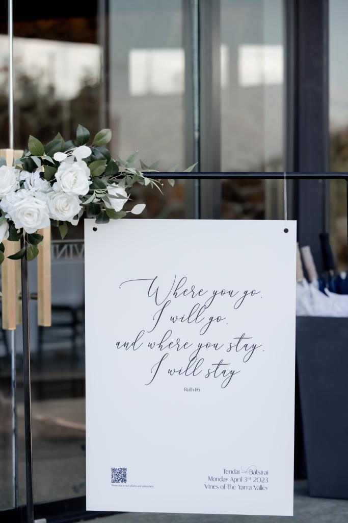
The signs were created with the same fonts as the stationery. They were printed on an eco-friendly aluminium and rubber, rather than foam or acrylic, and looked just as amazing. Tendai and Batsi again brought more personalisation to their signage by adding a meaningful scripture to the welcome sign, and a QR code so that guests could upload their photographs to an online folder! Both signs required hanging from their rented sign stands, so holes were included in the signs at no extra charge.
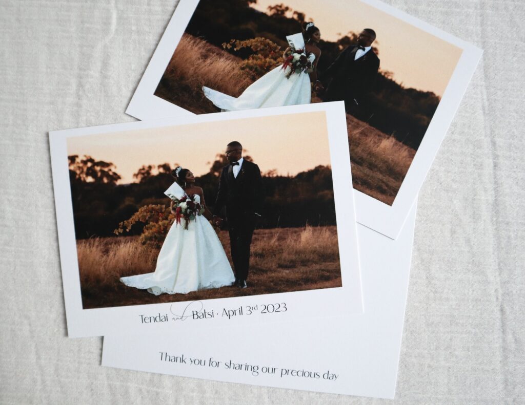
We also created thank you cards! It’s an important step to do after the wedding, made all the more special when a photograph from your photographer is included.
And how did Tendai and Batsi feel after working together for so long? They left me a very kind Google review…
“100% recommend! Thank you again Natalie for making our dream stationery become a reality! Your attention to detail and unique style made sure our stationery stand out! You were so patient with us and became such a reliable part of our wedding planning, making sure that all our stationery, from invitations to thank you cards were ready and delivered on time. You were the best and we were blessed to work with you! Tendai and Batsi.”
I love how everything has come together to create Tendai and Batsi’s overall vision of rustic with a touch of luxury. Although, I would call this a romantic luxury with that beautiful colour palette! Let’s take a look at the stationery. Wedding day photography by Alexandra Bradley Photography.
Want to work with me to create your own wedding invitations? Get in touch now!
