
We’ve been through some stuff over the last two years. It’s been a lot. So when I had the idea to organise my own spring garden wedding styled shoot, I know that the images had to exude joy, hope, and warmth. There’s nothing better than the first warm day of spring after a long winter, and in 2022 it indeed felt like we were coming out of a very long winter. The idea for Spring Joy was born.
“And as the sun went down, the warm light hit her face, and she knew this was the beginning of a love that would last forever.”
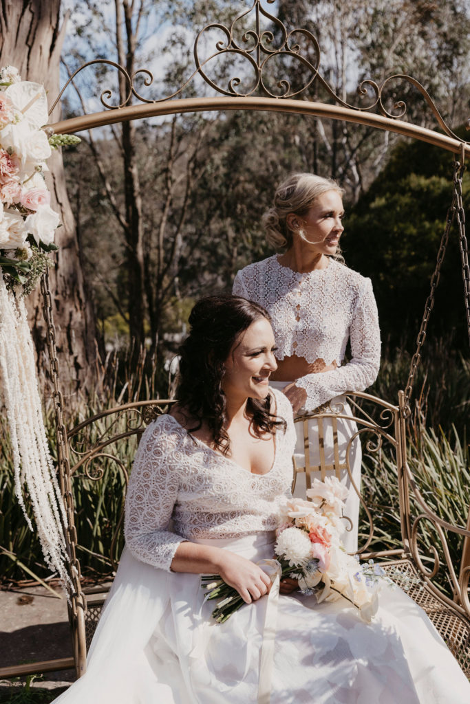
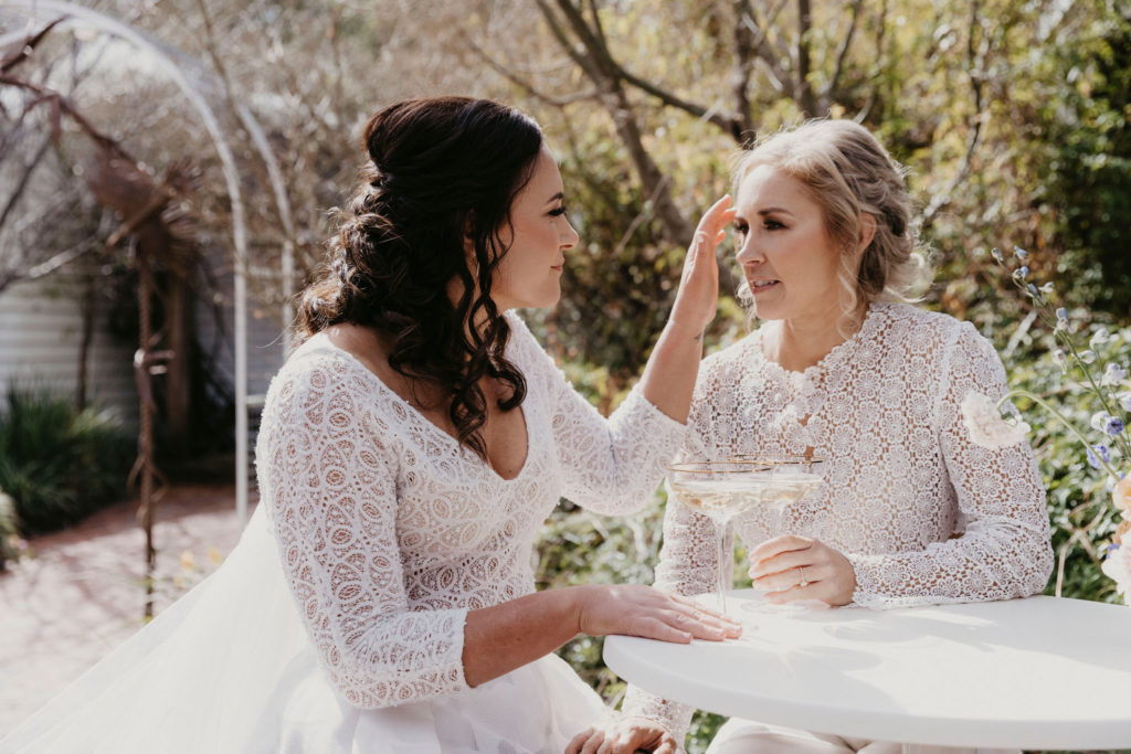
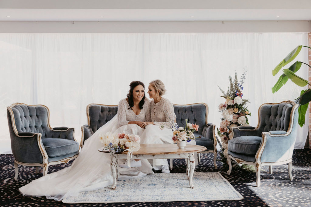
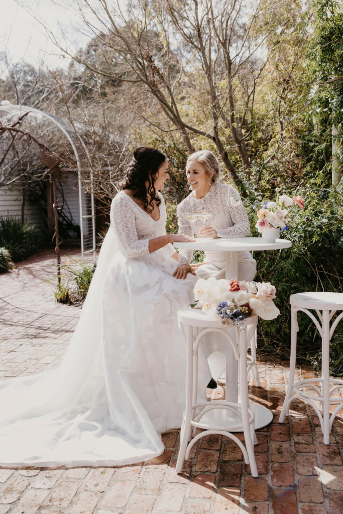
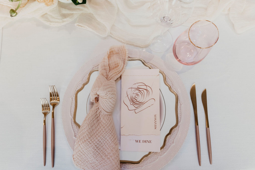
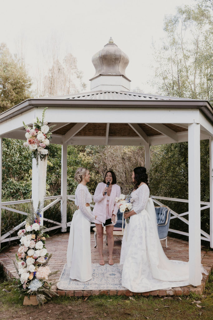
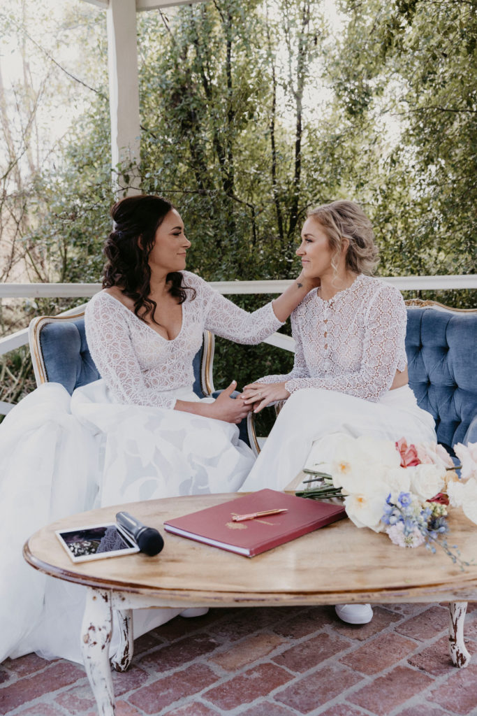
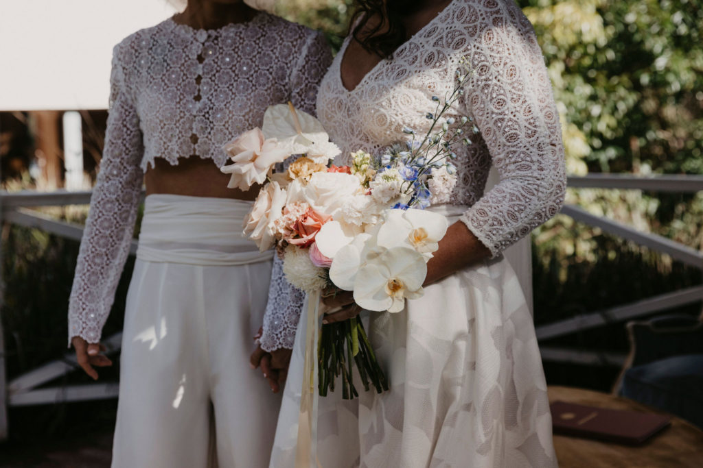
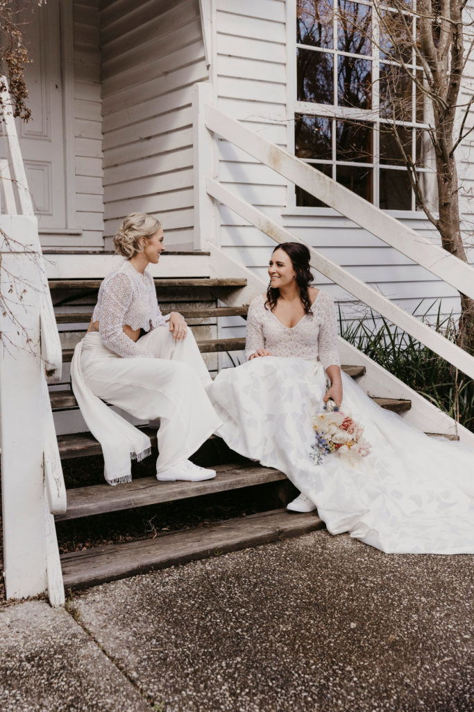
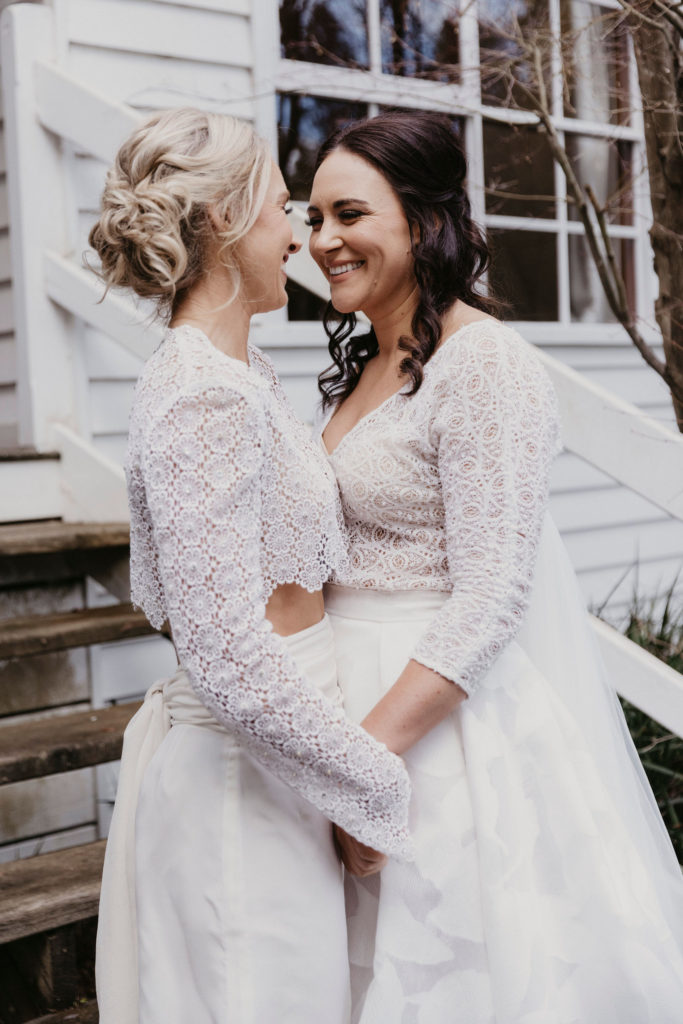
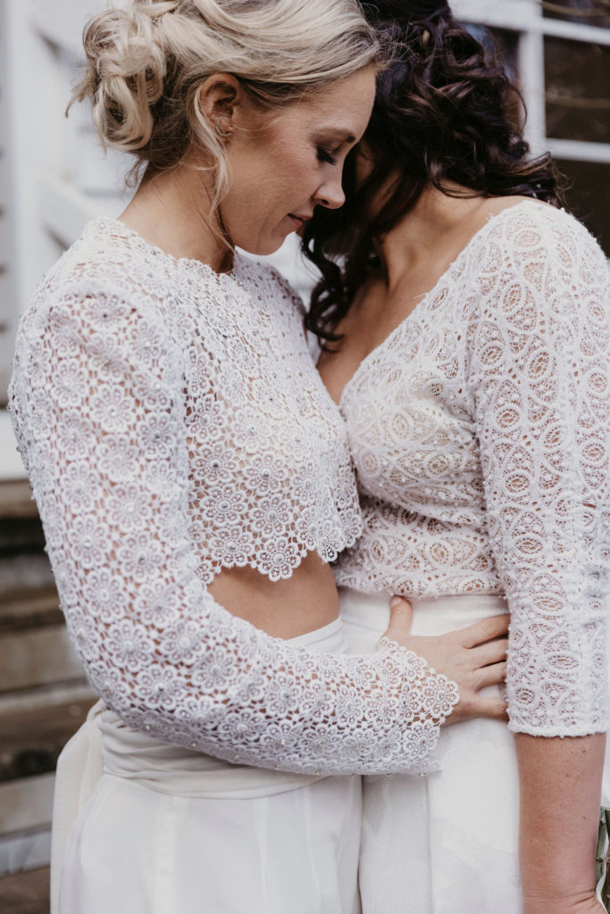
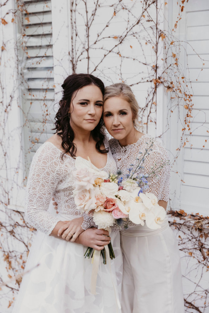
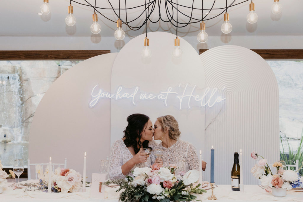
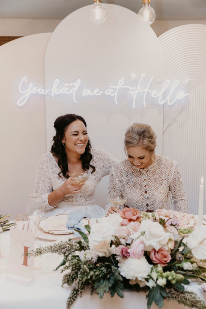
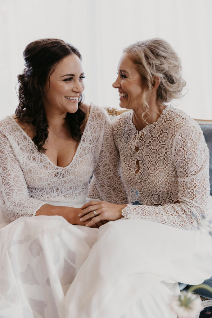
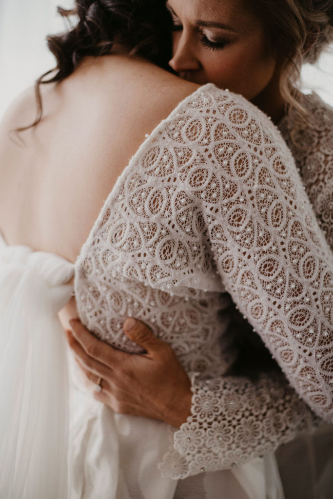
A creamy palette of peach, yellow, pink and a touch of blue straddled the borders between pastels and brights, and felt warm and inviting. As is the case with all my work, I wanted touchable textures and unique elements too. It was also important to me to feature a same sex couple, not featured enough in wedding images in my opinion. With these themes at the forefront of my mind, I began to contact local suppliers who I knew could deliver on the brief.
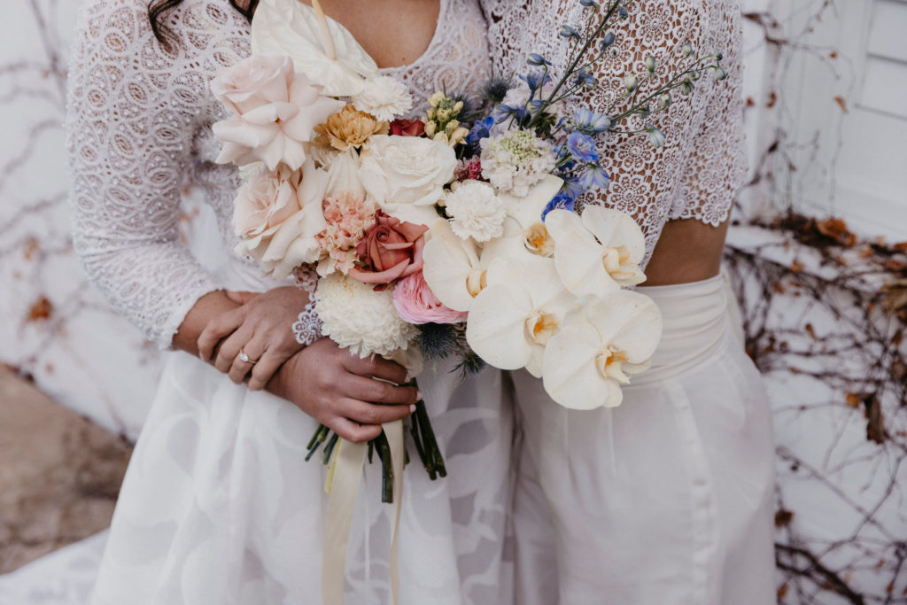
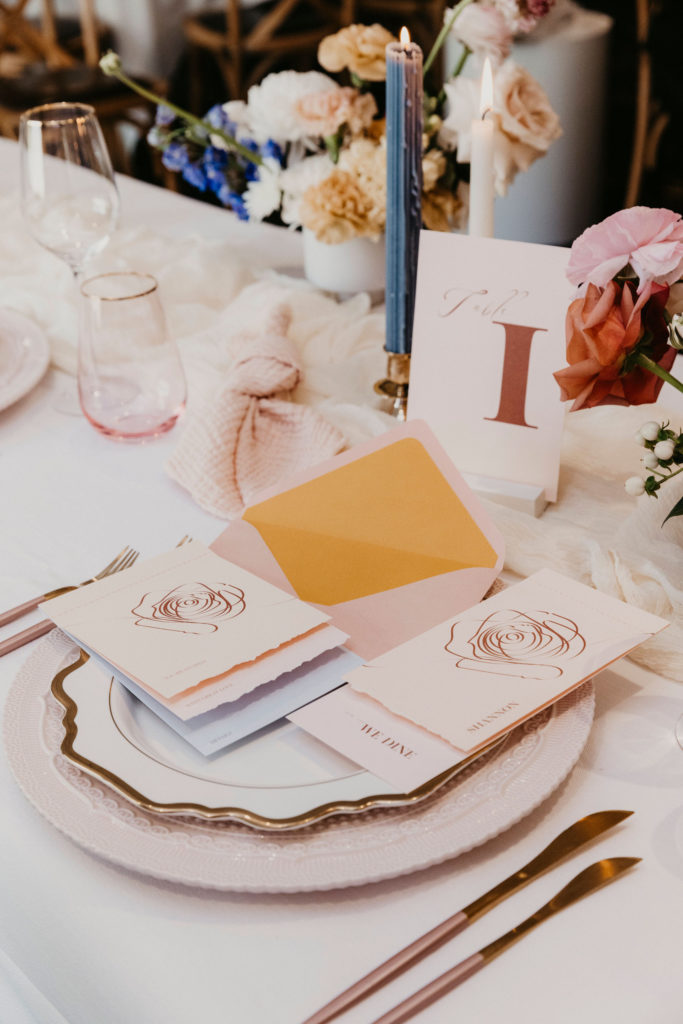
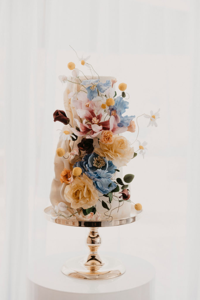
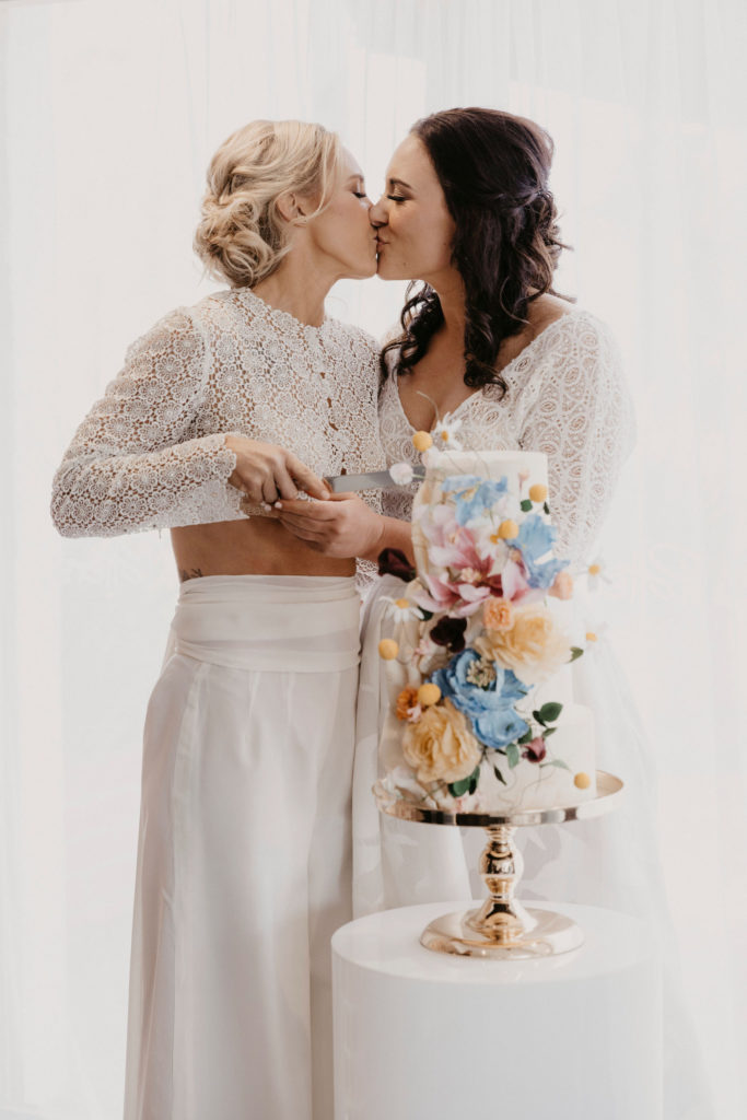
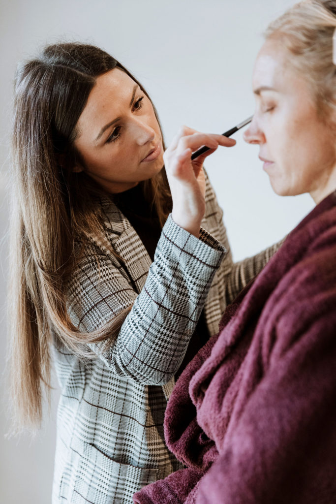
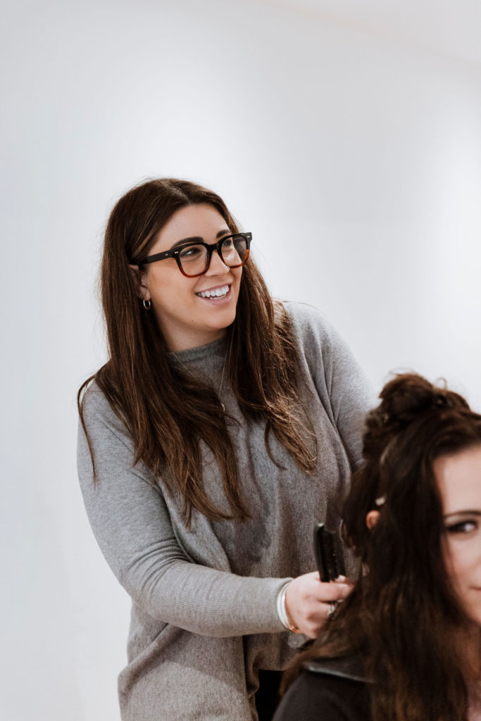
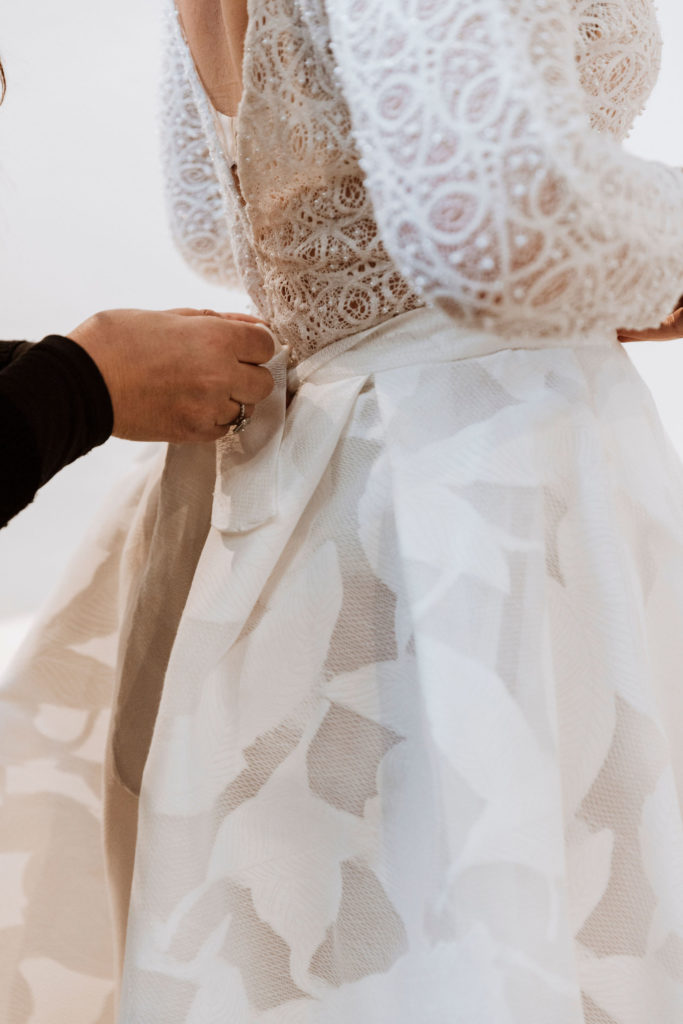
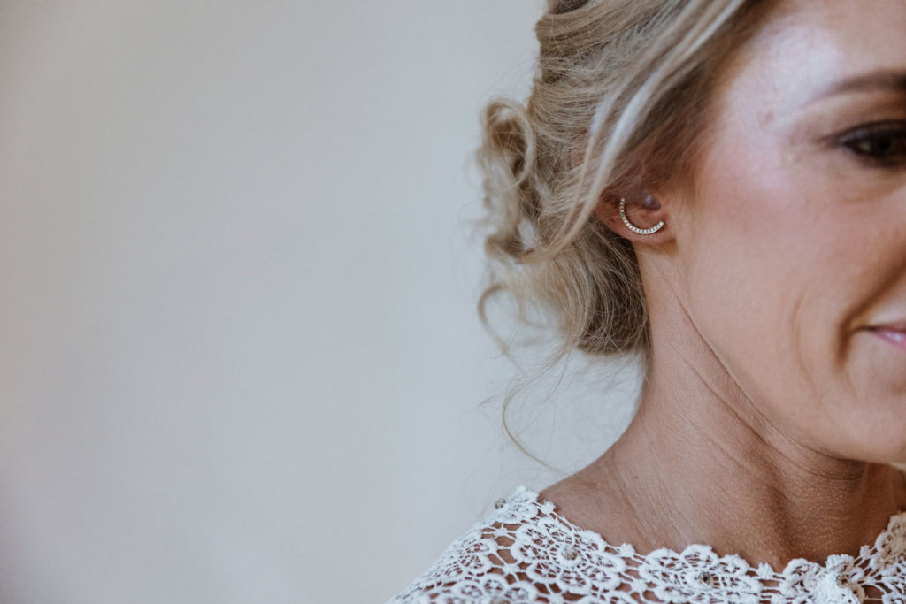
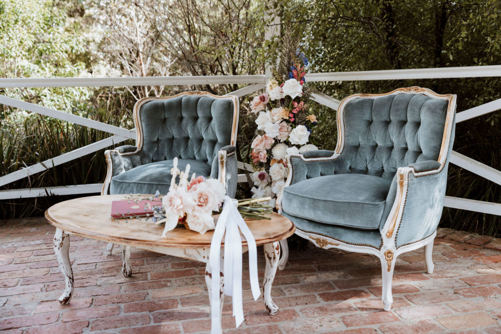
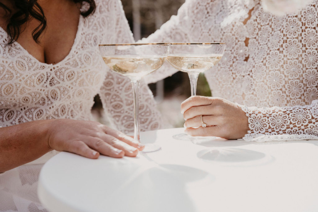
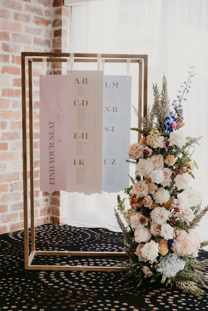
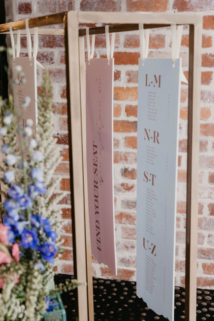
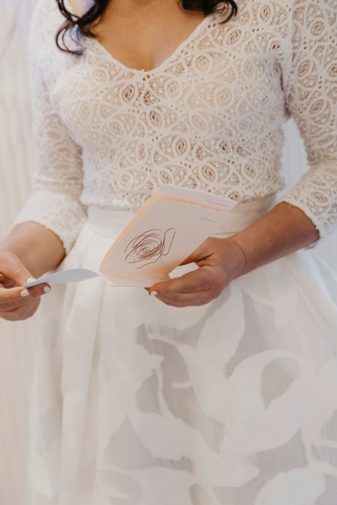
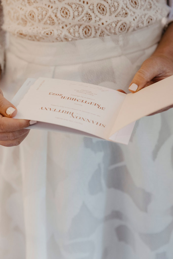
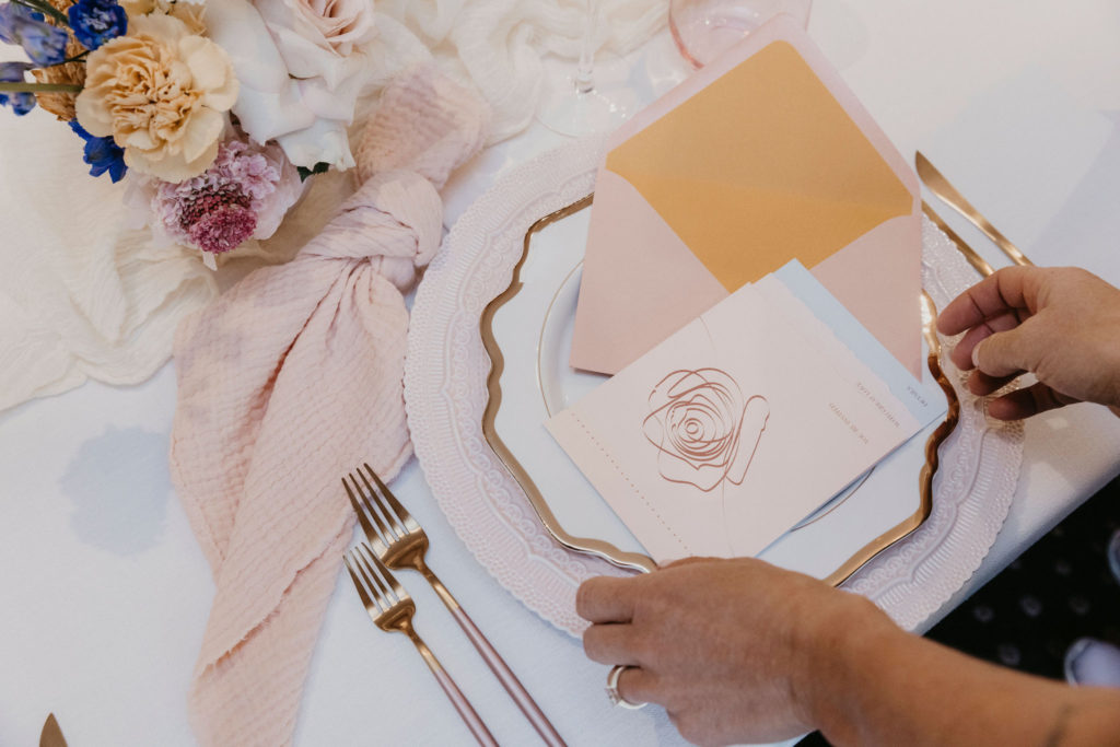
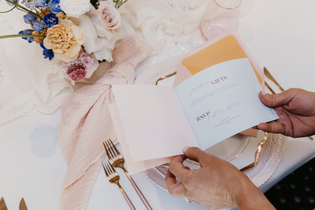
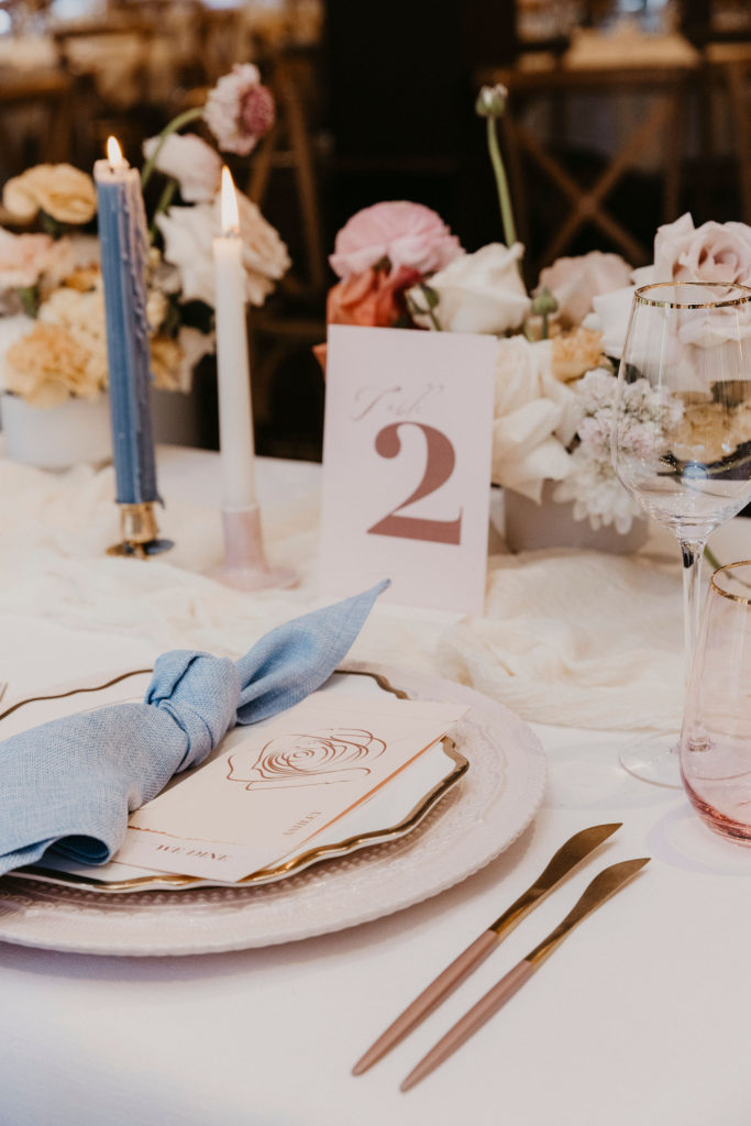
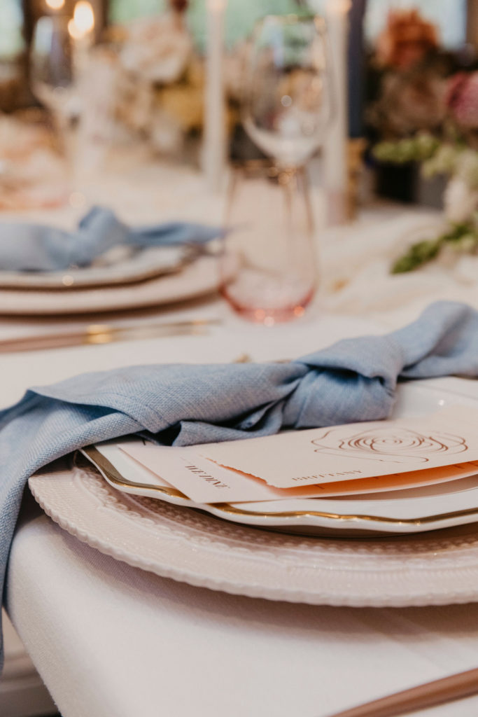
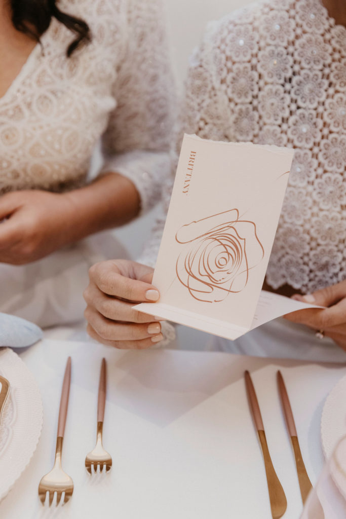
Potters Receptions hosted us, with alluring gardens at every turn. Ada and Ivy delivered stunning photos after she shot the day with expertise and calm. Lunar Red Films was by her side, and created beautifully detailed film. I worked alongside wedding planner and stylist Paradise Hunter to execute my Spring Joy vision, and she did not disappoint! Real couple Shannon and Britt were “married” by fun-loving celebrant Megan Thompson. Romeo Bastone Couture dressed the women in a figure-hugging dress and pant and top combo, after the women had spray tans by Spray Aus, gorgeous natural makeup by Jayde Maree, and exquisite hair styling by Jess Bourke Hair Artistry. We loved adorning Shannon and Britt with jewellery by Violet Jessop, and stunning bouquet by Yarra Valley Blooms, who of course used her creativity to also provide floral towers and pots. The little details are so important to the overall feel, so we were elated to have furniture from Always Eventive, linens, cutlery, and candle holders by Cloth and Confetti, and plates and glassware by Lusso Event Hire. The wow-factor was the cake, an original and colourful design by Breearn Murray Cakes. Did I mention stationery? I created a brand new design for this shoot, with sewing and hand-torn edging across the invitations suite and menu with place card. Table numbers identified each table, and a dynamic and unique three-piece table seating chart stood proud at the front of the room.
Let me say, shoot day was the best. When you have a group of suppliers who are high quality and work really well together, you end up with the most beautiful day with seamless execution – exactly what you want for your actual wedding. Take this hot tip from me – get recommendations from other suppliers, because we know each other and know what works.
Caitlin from Paradise Hunter had this to say: “In terms of the incredible suppliers involved in this shoot, you could not have picked a better bunch of creatives. Everyone played their part in bringing their vision to life and we all got along like a house on fire, which was a huge contributing factor to the amazing result we achieved as a collective.”
Each supplier really did bring their own creative energy. When I sent the brief and moodboard to all the suppliers, Bree from Breearn Murray Cakes really thought deeply about what she wanted to create: “I always put thought and feeling into my cake designs. The cake was no different, if anything it was the most meaningful one to date. Like most of us, I also struggled during lockdowns. For me the design was a way of showing not only the troubles and hardships we all endured but also growth, prosperity, and a way of looking at the brighter side of things. A way of moving forward when we all felt like we had been stuck for such a long time. I wanted the cake to be bright with loads of colour, not only to represent spring but hope. Hope is the one thing that we all help onto during those difficult months. Each flower is handmade. A reminder that things take time and patience and that some things require the right conditions in order to flourish and show their true potential.” Isn’t that special? You can view the Instagram reel of Bree making this cake (that this quote comes from) at this link.
Seeing the final images made me draw breath – when you put your heart and soul into a vision and they come out this lovely…it made me feel really proud.
If you are loving this joyous spring garden wedding as much as we all did, please get in touch and I can create the stationery for you. And I can refer you on to this amazing team!
Love the stationery and signage? Make it yours by contacting me.

Be the first to comment